Nike Case Study
6 min read - 2017
Project
Redesign Nike’s website to allow for more discoverability and easier navigation through it’s massive library of items.
My Role
UX/UI Designer
Timeframe
1 Week
Team Members
Caffeine - Project Management
Software
Nike Homepage
I began by sketching out the IA for the Nike website and creating a scope for this massive brand. Nike has multiple brands (Hurley, Jordan, Converse) and corresponding sites so I started by reviewing each of the child sites. I used the Double Diamond approach for this redesign.
Hurley Navigation
Hurley had a horizontal and vertical navigation. The horizontal navigation was superfluous and didn't really get me any closer to the products. The vertical navigation on the other-hand was the actual way I was getting to the product.
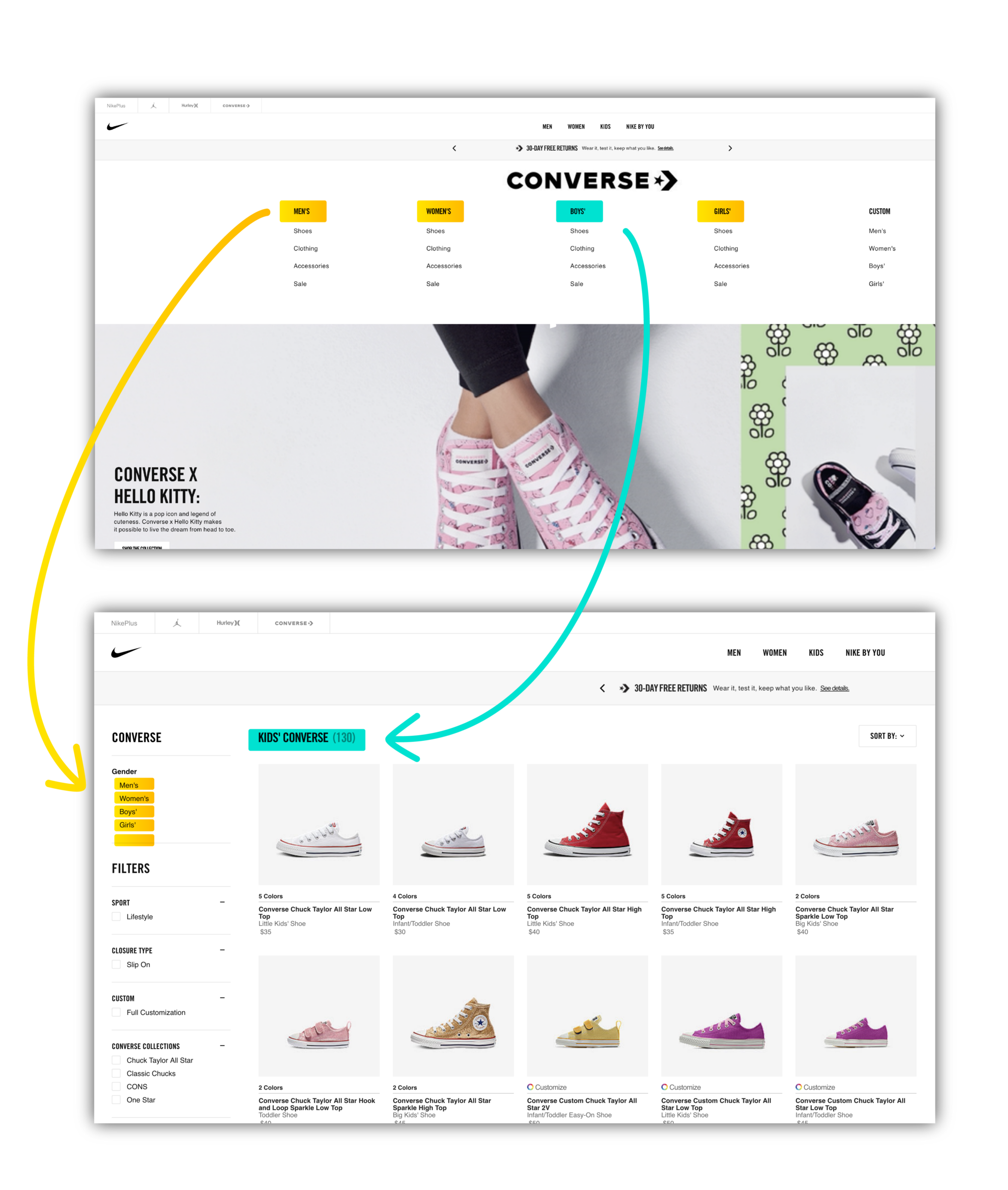
Converse Navigation
Converse had one horizontal navigation with five categories and four sub categories respectively. This navigation then triggered a vertical nav when selecting a category or sub category. the switch from horizontal to vertical rather jarring and compounded the cognitive load.
Jordan Navigation
The Jordan brand was similar to Convers, but with only seven categories and no subcategories. The vertical nav was inconsistent and switched to exclusively gender and neglected the previous pages non-gendered categories (shoes, clothing gear, women, etc). This inconsistency was illogical, with the exception of the (Air Jordan Collection and the AIR Jordan Blog).
Nike Navigation
Nike had the parent navigation that remained the same through all the brands, this navigation would often times be redundant in the vertical navigations that appeared once a product is selected.
By comparing the sites side by side, I easily saw how the architectures varied by brand.
After viewing all of the sites together I took some notes on what needed to be redesigned:
Enhance backward navigation through all brands.
Create a consistent navigation between all brands.
Call out the search feature for ad hoc inquiries.
Brand Toggle
I kept the integrity of the original IA which separated the brands, but I created a toggle for the various brands. This made the filtering for the sub categories more niche and not as lengthy when drilling-down into the third branch. I added some affordance with a white background that was missing from the original site.
Original Site
My New Brand Toggle
The default brand would be Nike since it has the most products, categories and most common workflow.
Brand Toggle (color redacted for gif resolution)
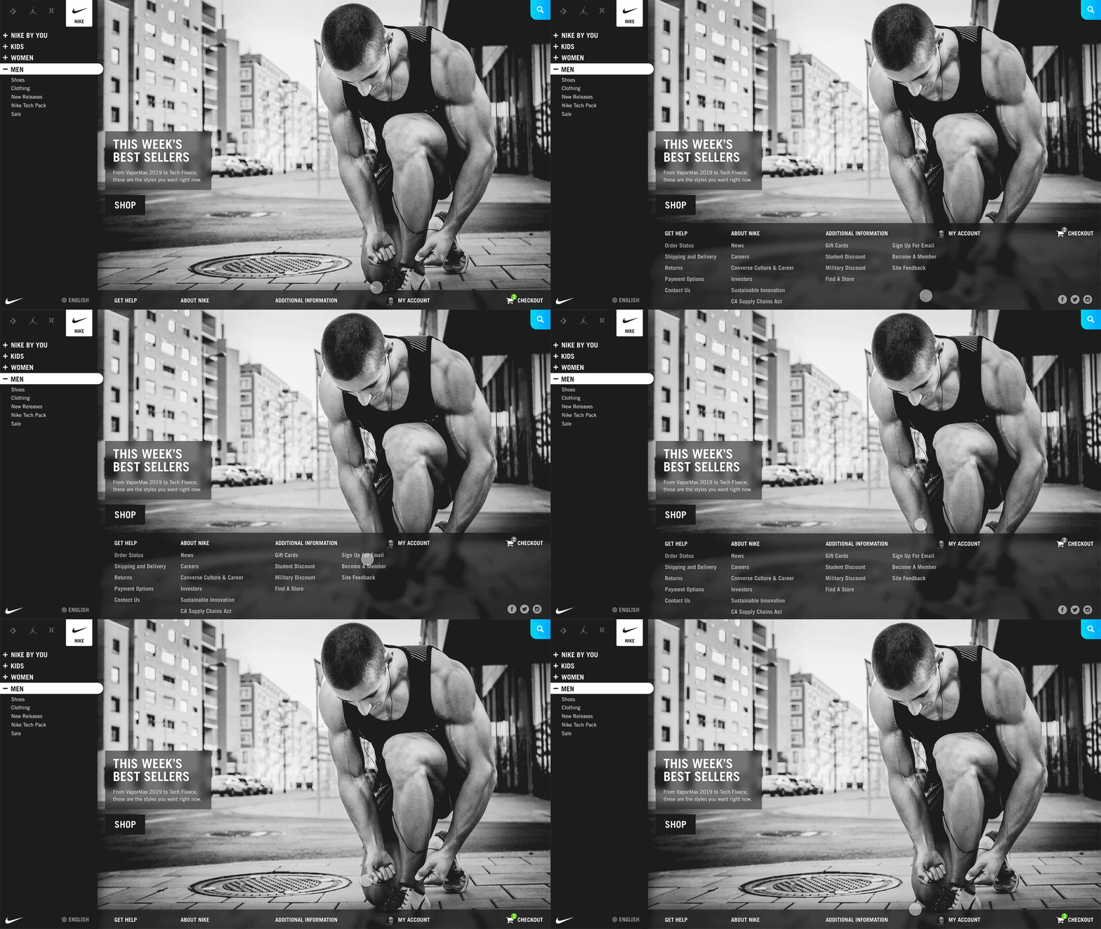
Main Navigation Hover
For the main navigation I kept the information in a hover state selection menu, but only included the information that wasn’t inside an existing category. This progressively disclosed the redundancies that were occurring.
Original Nike Navigation
Nike Home Screen (Full Color)
Hover State
In my design, my hover information varied based on category (Men, Women, Kids, Nike by You) but remained the same when navigating between brands.
Non-Hover State
Accordion Structure
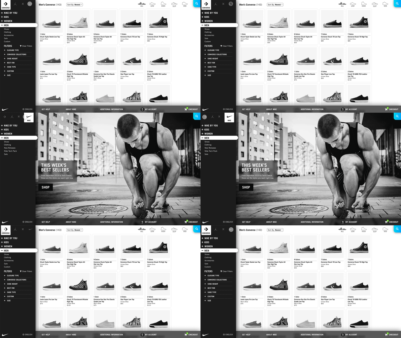
I modified the accordion menu to each of the brands with four main parents (Men, Women, Kids and Nike by You). This made navigating back much easier and more elegant solution than frantically hitting the browser’s back arrow.
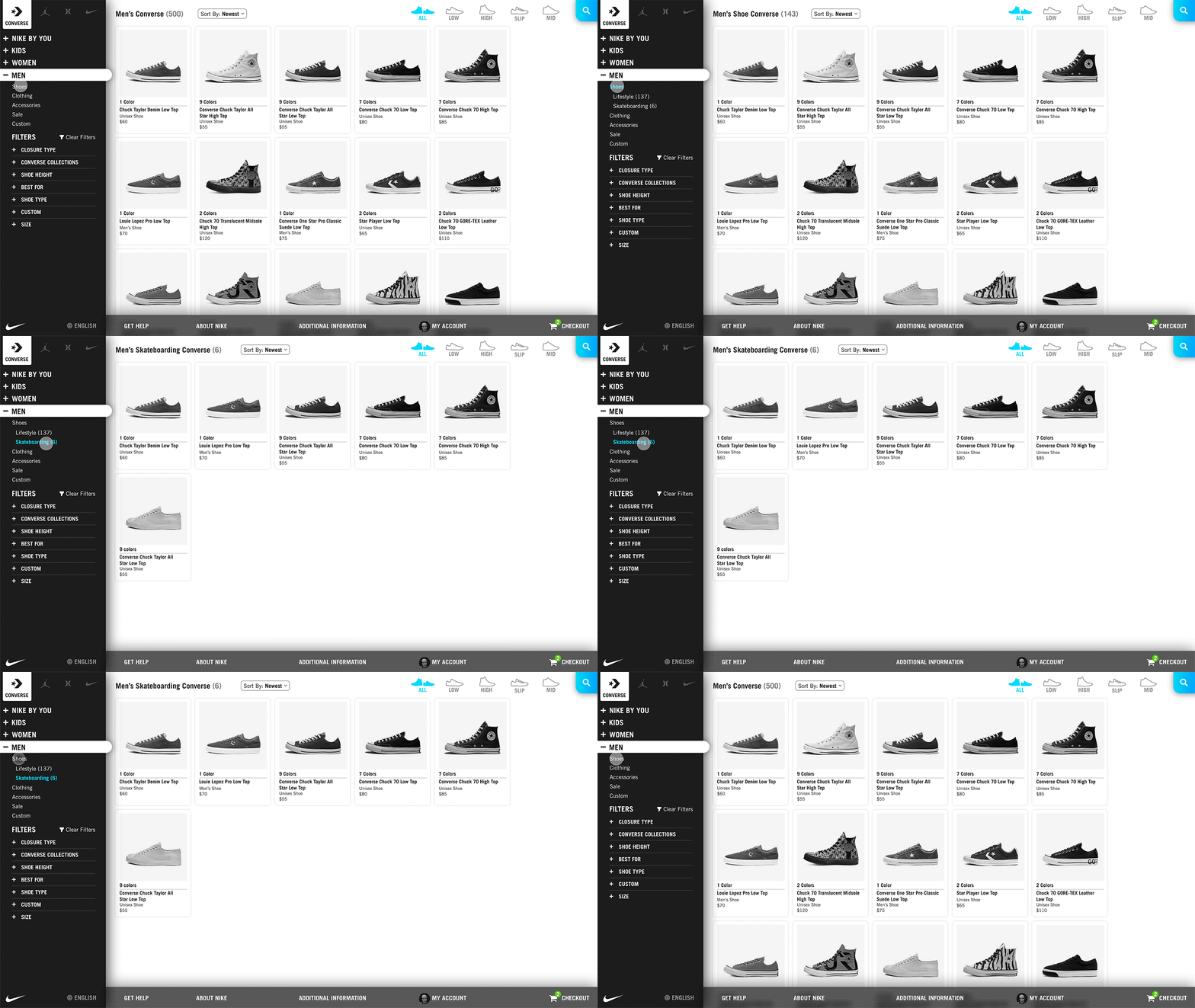
With my design you could move your way down the vertical navigation and get more and more specific results. Brand, Gender, Product, and Product Filter.
Converse Accordion Menu (color redacted)
Nike Accordion Navigation (color redacted)
Bring Out That Search Feature
Some people don’t know what they want or they are like me and know exactly what they want. Like a size ‘11.5 White Air Force SF High Top Winter Camo’. So I highlighted the search feature to meet both of these extremes.
Search feature
Search began a new modality. With my layout, the products could fill the screen . Or maybe nothing will appear like in my case, in which I closed out of the modality.
Filtering
Some products had secondary filters (style of shoe). The filters up in the top quadrant would be hidden when the search feature was enabled . This hints at the relationship between filtering and searching.
Secondary filtering (color redacted)
Sticky Footer
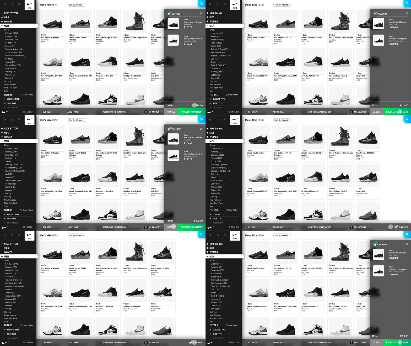
For the footer, rather than scrolling to the bottom the page, I placed the footer at the bottom of the page and incorporated a pop-up checkout workflow. All of which was progressively disclosed inside the footer.
Checkout Footer Pop Up (color redacted)
Checkout Footer Pop Up (color redacted)
Hover Preview
The previous hover would cover up the other products. I created one that highlighted the product without overlapping the other products.
Original Hover Preview
Hover Preview (Color Redacted)
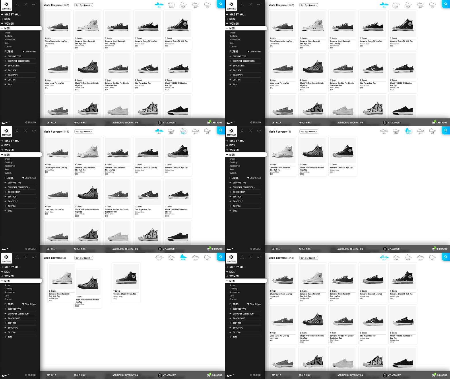
Microinteractions
These microinteractions give the end user constant positive feedback to let them know the system is working.
Navigation micro-interaction animations
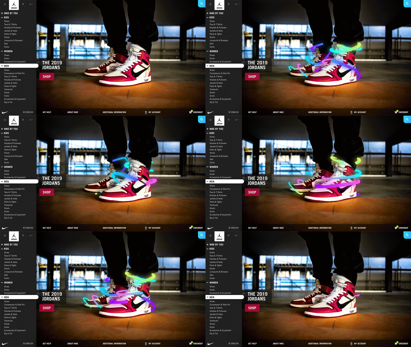
Add Some Pizazz
With a uniform architecture the art direction and branding will become more important to orient Nike’s consumers. So those designers better workkkk. I created this one in after effects I call it rainbow swirl
Rainbow swirl landing page animation

